-Abstract Reductive Design-
You should be able to do these things during this project:
1. Change colors using the "color chips", to be applied with the "fill operation and gradient tools as well as the gradient editor".
2. Apply a color to a background using the "fill operation and gradient tool".
3. Create new layers, rename them.
4. Use the "eraser tool" to create a reductive layer.
5. Load new brushes into the brushes palette.
6. Edit "Brush Properties" in the brush palette and change their size
7. Make layers invisible.
8. Change "opacitiy and color modes" of individual layers.
9. Add "layer styles" to individual layers.
10. Create a border.
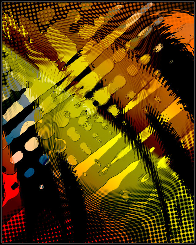
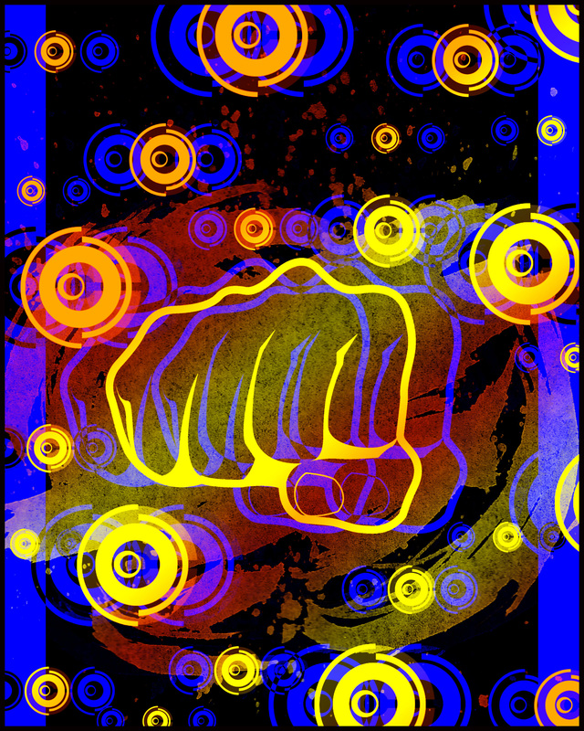
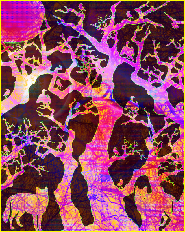
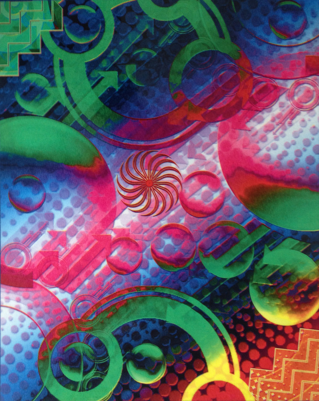
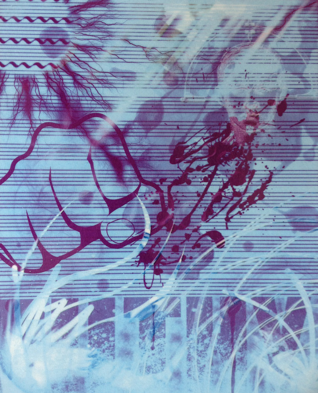
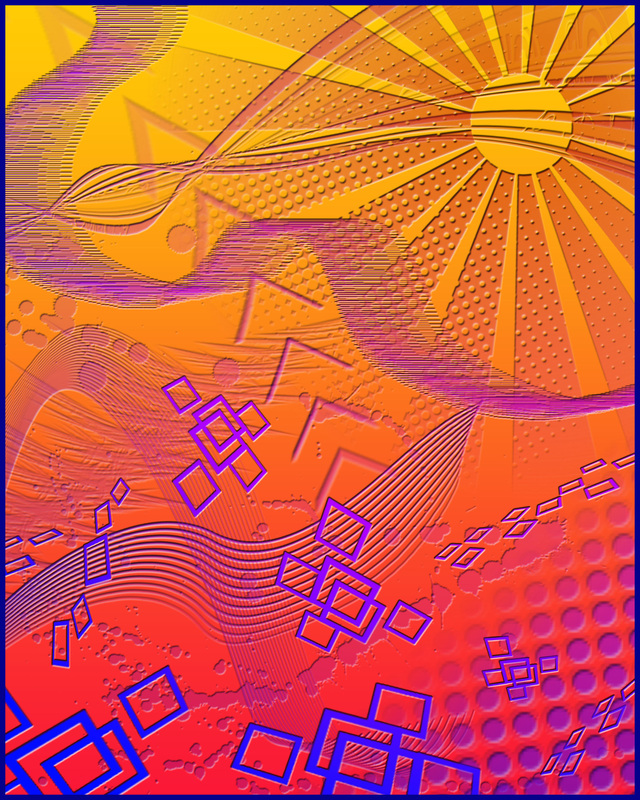
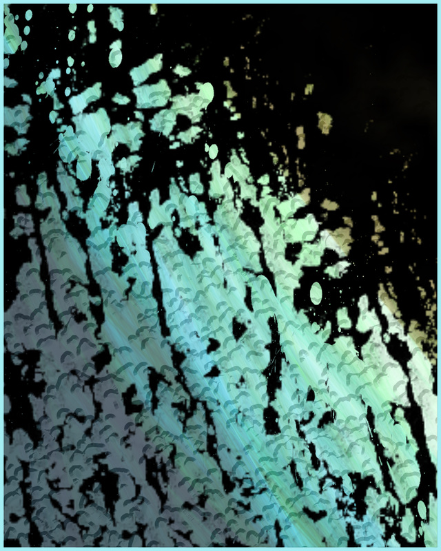
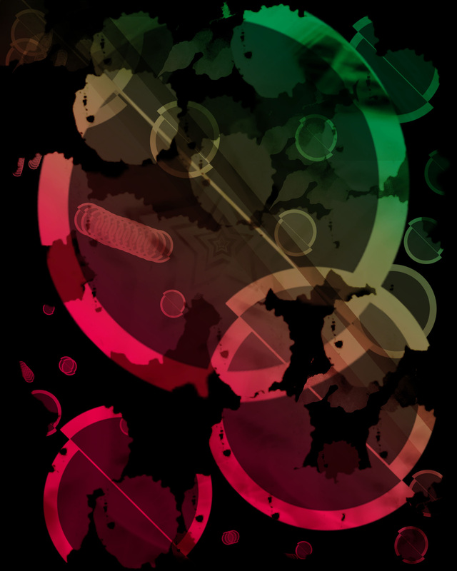
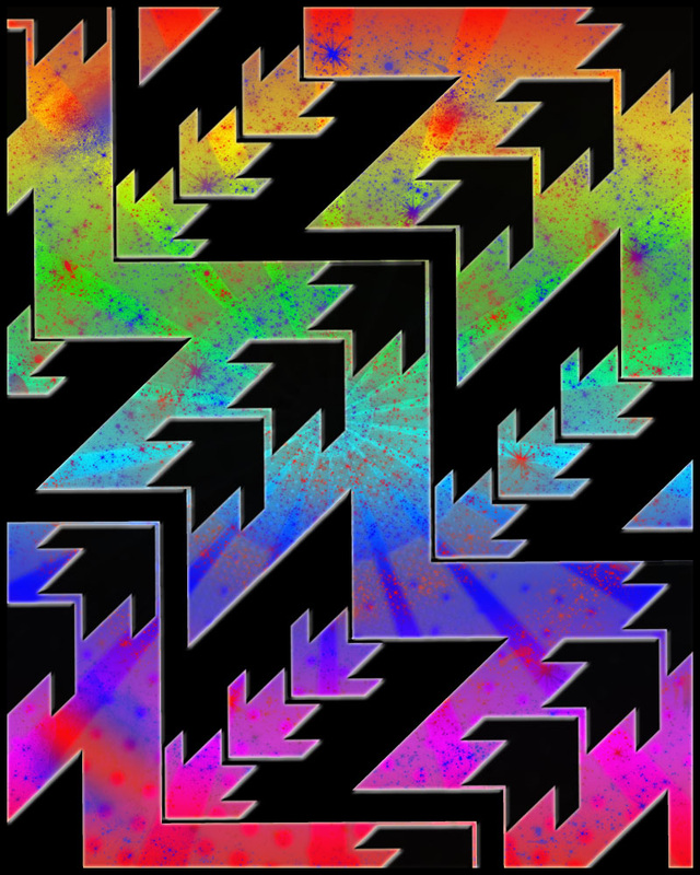
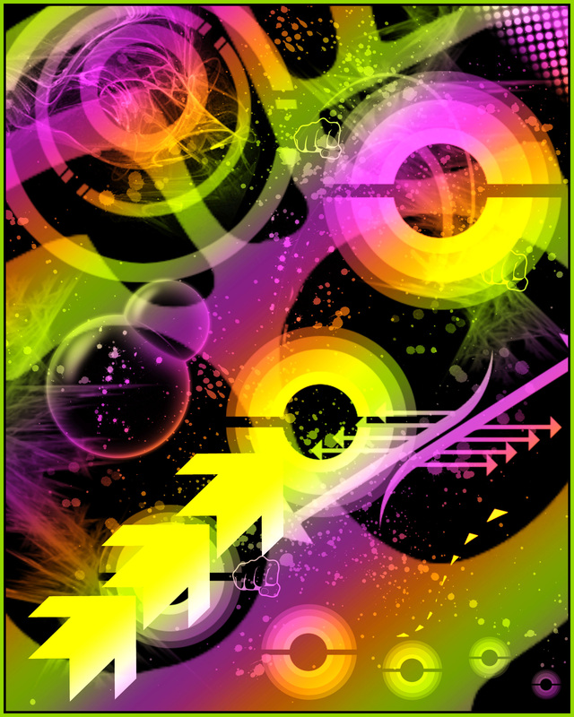
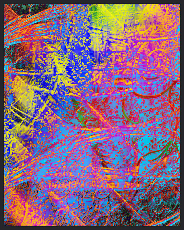
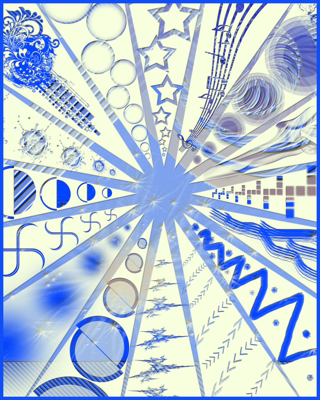
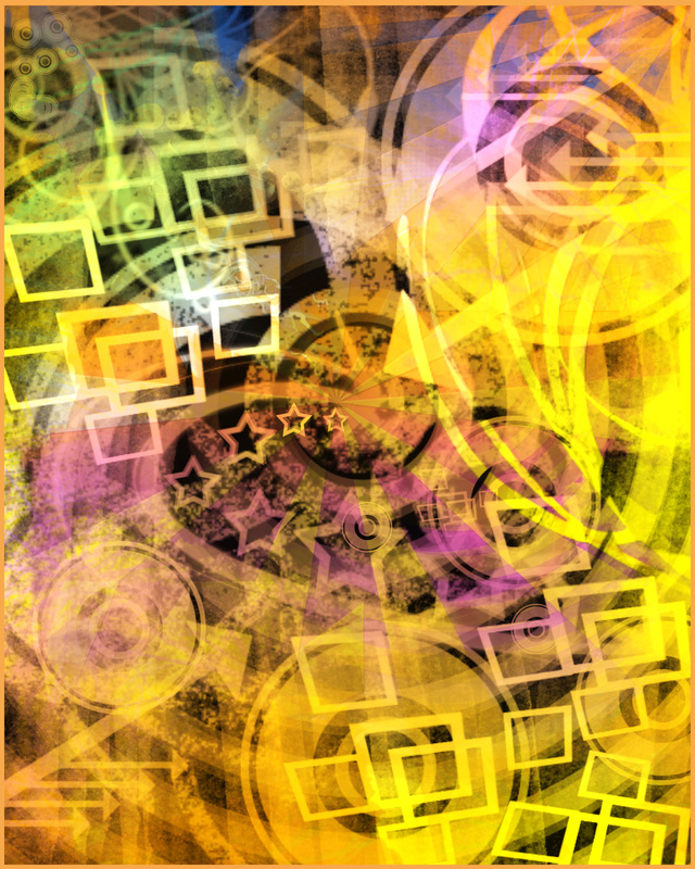
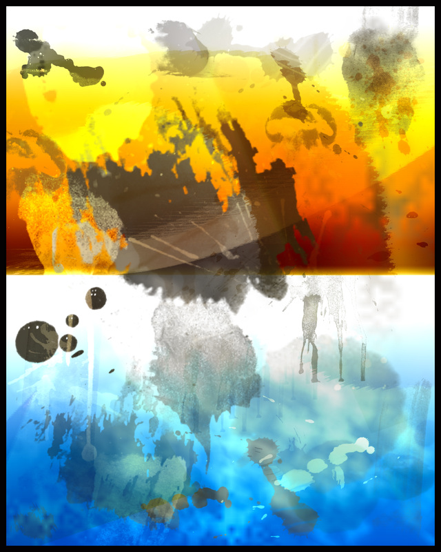
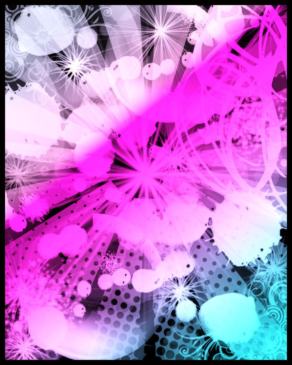
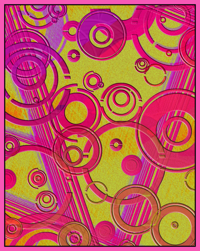
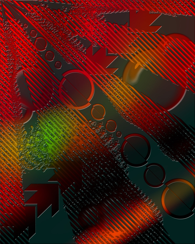
Student Examples
1
|
2
|
3
|
4
|
5
|

6
|
7
|

8
|
9
|
10
|
11
|
12
|
13
|
14
|
15
|
16
|
References: Negative Space
Abstract ReductiveDesign Description
This project will require the use of the eraser tool by subtracting shapes as opposed to adding them. We will implement different brush types to create a design that utilizes the elements and principles of design into a unified work of art. We will use many of the same ideas as in the verb design but just in a different process.
Step 1
"Starting out"
|
Specifications:
11 X 17 150 DPI Create three different designs on one canvas: Canvas set-up requirements: 1. Three different backgrounds to choose from as well as one white 2. Three different black layers for reductive designing (Erasing) **Your Layer Box should look like the one to the right**----------> **Other design aspects to be utilized: 3. Use of assorted/custom brushes 4. Overlapping 5. Different opacities and sizes of brushes 6. Rotation of brushes Once we have created three seperate designs, We will walk through some more advanced steps/tweaks to add more depth and abstraction. 5-1 Abstract Reductive DesignUse these Video Tutorials and Psd. files to help you through the project |
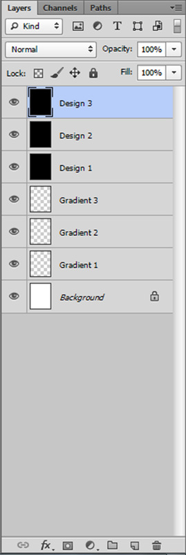
This is how your Layer Box should be set up before you start designing.
|
Use this file as an example:
It will open up into Photoshop as fully layered file...
It will open up into Photoshop as fully layered file...
Step 2
"In Process"
"Just a nice explanation"*This is how your layerbox should look during the begining of "Step 2".
|
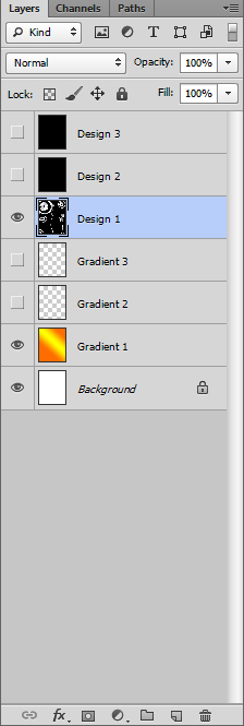
This is how your Layer Box should look when you start designing. Notice I am erasing away from "Design 1" and letting the color of "Gradient 1" show through.
|
Use this file as an example:
It will open up into Photoshop as fully layered file...
It will open up into Photoshop as fully layered file...
Step 3
"Final Tweaks"
Advanced Tweaks!!7. Change Color Mode of Gradient Layers
**As well as their order in the Layer Box. 8. Add Layer Styles to all Design Layers **Gradient Overlay **Color Overlay **Stroke **Inner/Drop Shadow **Bevel and Emboss 9. Change order of Design Layers **Change Opacities of Design Layers 5-2 Abstract Reduc tive Design-"Tweaks"Use these Video Tutorials and Psd. files to help you through the project |
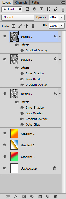
This is what the Layer Box might look like when you are finished. We will do this process after you have created reductive designs on all three black "Design" Layers.
|
Use this file as an example:
It will open up into Photoshop as fully layered file...
It will open up into Photoshop as fully layered file...
Border Tutorial |
Custom Brush CreationWhen you get done...
|
Art Criticism
Step #2
"Analysis"
Example writing for Step 2 "Analysis"
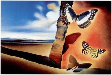
Next, tell how all the answers from the description you just made are related to each other, ie, how the above facts are organized, compliment one another, or create harmony or distress. This step can often be the most confusing, because it is very similar to the first and can easily overlap. A good suggestion is to think about some of the “principles” of art: movement (or rhythm), variety, proportion, emphasis, balance, contrast. (I have seen some people list “scale” as an art principle, but again this seems redundant to me–it’s basically a more detailed word for what we mean by “proportion.” The Wikipedia entry on design elements and principles is a valuable resource if you need specific help sorting out and defining all of these terms.)So put on your detail goggles and dive in… As I view this piece, my eyes are occasionally led over to the vanishing point on the left (in the distance), but keep coming back to the focal point around the butterflies. This movement happens largely because of the shadow that the rock casts in that direction. The blue of the sky and the orange of the rock are very intense and bright (highly saturated), and their opposition with each other also contributes to the back and forth motion of our eyes as we view the painting. If the blue color was not as saturated, more focus would be on the right side of the painting, it would have too much “weight,” and our eyes would linger there more. As a result, the painting’s composition would be less balanced. Also, because the butterflies appear to be abnormally large (in comparison to what we assume is a rock face or cliff), we do not have a concrete sense of scale or proportion. This creates an interesting sense of ambiguity, and as a viewer we’re not sure if in fact we are very small, or simply lying close to the ground, or if these are mutated giant butterflies next to a huge cliff. Who can be sure? There aren’t even any pebbles on the ground or other recognizable objects in the paintings to give us clues about scale. The bottom-most butterfly shadow (as well as the butterflies themselves, and the shadow cast by the rock) has a sort of glow around it caused by the lighter orange color surrounding it. This causes the shadow to further “emerge” from the surface it’s supposed to be cast on, making it appear more three-dimensional and adding focus to it. We know that actual, “real-life” shadows do not have this effect, and so it creates a surreal feeling–one of the things Dali’s paintings are most famous for. |
|
Good questions to ask yourself!!!
Analyze: The Principles of Design...Look at how the elements of art are organized.
- What kind of balance is displayed? Is it asymmetrical or symmetricla?
- Is the rhythm created through repetition? What is repeated? For example, lines, shapes, color, objects, etc...
- What is the focal point? What is the first thing you see?
- Whaere are the light areas fo the image? Squint your eyes and look at the image.
- Where are the dark areas of the image?