Typography "In-A-Nutshell"
Typography is the "Art of Type", It's kind of a boring word that gives this art form a bad name...(Kind of like this font I'm forced to use). Typography is actually what makes all text we read visually make sense. Without text a photo is open to interpretation, text narrows our focus and creates a connection to the design by way of color, size, font and placement. All these ideas must be taken into account to create a connection between the theme of the design and the text.
Text isn't always used to just create words. Don't forget that text is merely a shape that we interpret as an English character, from which we arrange into words to create sentences and paragraphs. Text should always be intended to create a connection with the theme of the design, and doesn't have to be a word that is located within the bounds of the visual canvas. Text can be used as shapes that fall off the page, or used as background texture...forget what you know... experiment...life doesn't always go from left to right! And neither should your text...
Text isn't always used to just create words. Don't forget that text is merely a shape that we interpret as an English character, from which we arrange into words to create sentences and paragraphs. Text should always be intended to create a connection with the theme of the design, and doesn't have to be a word that is located within the bounds of the visual canvas. Text can be used as shapes that fall off the page, or used as background texture...forget what you know... experiment...life doesn't always go from left to right! And neither should your text...
Sample Writing
"The Plight of Janice"
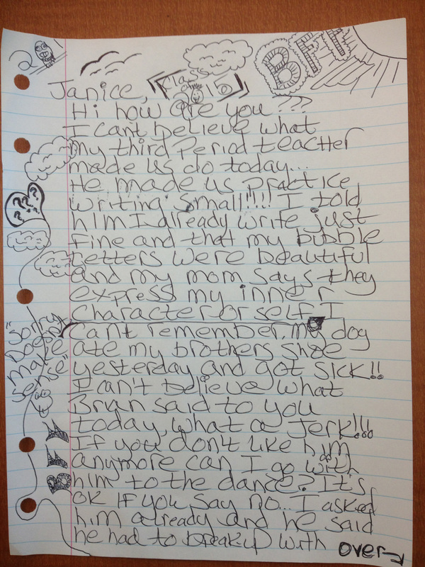
Great example of what we are fighting against!!!
Is this mystery student designing or decorating?
It's pretty obvious that our mystery student has ulterior motives within the subject matter of her writing. With disregard to the adolescent ramblings, we see that the author has made attempts to create a design that isn't simply a message, but a visual work of art...however it becomes quite apparent that this "work of art" is not a shining example of how typography and page layout incorporate to create a readable design.
Let's Break this letter Down a Little...
1. What has our author/designer done in efforts to create interest in the layout of the page?
(I personally like the "sun" in the corner...the first doodle I started with in Elementary!!)
(I personally like the "sun" in the corner...the first doodle I started with in Elementary!!)
Sun in the corner of the paper.
|
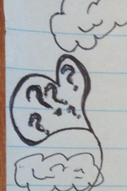
Heart
|

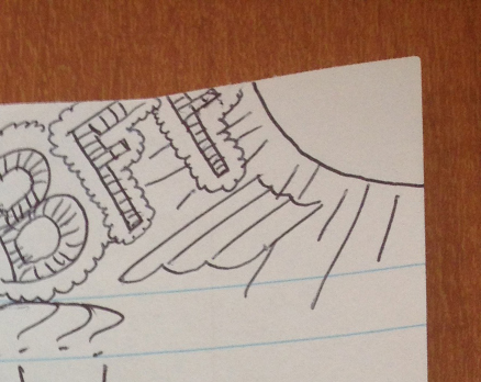
Nice header containning birds and clouds with the "Class of 2015"
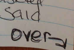
"Over", Really? Thanks for the advice!
|

Beautiful margin packed full of stuff!
|
2. The next question we should ask is ,"Is this layout unified? And if it is...is it readable?"
Well....is it?
In all seriousness...this design actually does contain elements that work together to create unity, for example:
-All the text is consistently justified to the left.
-All the text is the same height, (this is good and bad...)
-There is only one font and it has all the same shape characteristics..."bubbly and slightly messy".
-There is a title, "BFF"..."Class of 2015"...
-All the doodles follow that same shape characteristics as the text.
-The placement of the doodles around the body of the text integrate and flow together to allow the scene to make sense.
*The sun and clouds are above the birds and balloon with a squiggly string that wraps itself around the punched holes in the margin.
-The entire design has a cute and funny overtone that consistently reminds "Janice" the she is the authors "Best Friend
Forever", even though she has already stolen Janice's boyfriend...
-BUT!! CAN WE READ IT?
-Yes we can, but not easily...
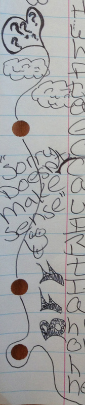
Justified to the left with the heart Balloon.
|
Text is all the same height, bubbly and slighty messy...
|
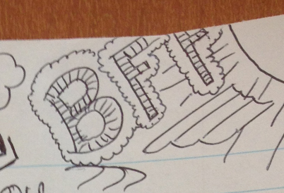
"BFF" Best Friend Forever!!!!
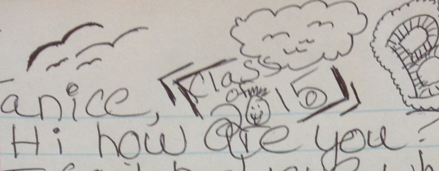
Class of "2015" with
Birds and Clouds
|

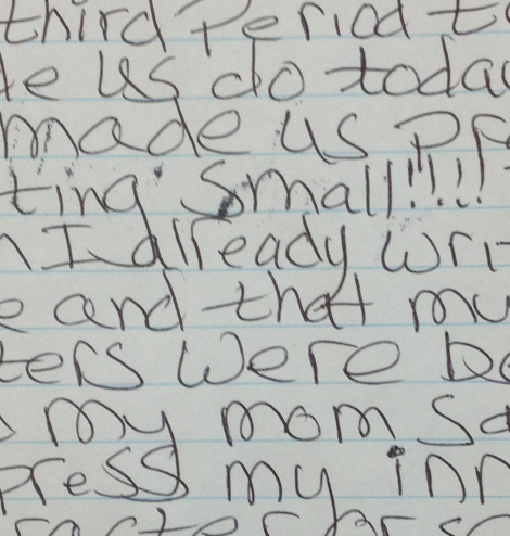
Original Note
|
4. So...How do we fix this mess? What should we consider and where should we start...?
Or maybe we should worry about Janice's anger management skills first!!!
-Either way, we need take into account all the elements in the letter separately.
-First, we need to keep all the text used in the actual body of the writing the same. We need only to worry about the size
and font, and how it will be positioned on the page. In this case we will most likely justify to the left only, we will
determine the font later after investigating the tone of the writing.
-Next, let's look at punctuation...this will tell us a lot about the mood of the writer, is she happy, sad, angry, hopeful :) or
or maybe just a little dense. In any case we need to stay true to the intent of the author, so let's keep her punctuation
too.
-From here the doodles in the margins and at the top of the page become extremely important. These come from the
authors "inner-most" artist, her imagination and the "stuff" that she is most interested in.
-Let's take a closer look at the Doodles...
-If we look around a little, we see a heart shaped balloon with question marks in it...? maybe a little foreshadowing to the
true intent of the "letter"?
-We also see clouds, which probably don't have much bearing on the anything but acting as background filler for the
balloon.
-Now how about those birds anyway? I'm thinking... set "Brian" free...? Probably not, just more good background
filler that our author/artist learned to draw last week, but good stuff so we'll try and incorporate those as well.
-The "Class of 2015" obviously helps to establish and create that all important pride in our artist's future legacy...
which we all hope she lives to see...
-Finally, the sun helps to create the physical atmosphere that surrounds all of the elements on the page and
helps to create depth. The body of the text creates the foreground, the heart shaped balloon is placed in the middle
ground with the sun and clouds along with the birds filling in the background.
-Waite a minute...what about the "BFF"?... Well I'm assuming that the author is trying to cushion the blow to
Janice before she breaks her hart! However, this helps to set the tone of the letter and establish the relationship
between the author and Janice.
Now what does all of this mean anyway?
It gives us a road map as to what colors, shapes and fonts to use in our efforts to make this a professional looking
letter...Even if we don't respect the authors ideas or opinions!
letter...Even if we don't respect the authors ideas or opinions!
Here's what we're going to do...
Let's imagine that this story turns into an epic tragedy of Shakespearean proportion and an Off-Broadway producer (way, way off!) get's a hold of the rights to produce this story as a play/musical. Now this production will need advertisement to display around the city, this is where you come in...
And here's how we're going to do it...
Use the above letter to design a poster using the following suggestions and criteria:
1. Let's figure out what we want to keep, we looked at this earlier so we have a good idea of what elements in this layout are good and bad.
-Understand that you have a good amount of leeway as to what colors, shapes and fonts you want to use. We just want to make sure that we stay true
to the authors intent.
-Use supplied paper, a large sheet.
-Feel free to use crayons, colored pencils, glue, construction paper or whatever other materials you feel will help you to transform this note into a
visually accurate and eye pleasing replication.
First: Look at the elements used, such as: Sun, clouds, balloon, birds and Class of 2015.
Now do we want to abstract them or replicate them exactly? We have the option to simplify them into more geometric shapes or turn them into
more realistic looking objects. Probably whatever you are better at...but it will have to fit with the theme.
Second: We need to figure out what colors we want to use, let's think of the obvious ones first...
-The sky is blue and clouds (happy clouds:) are white and fluffy.
-Now birds are a darker color, probably good to match them with the color of the text.
-The heart's an easy one...Red, but what about those darn ?'s, a good rule of thumb is whatever creates a good contrast.
-Waite, we can't forget about the yellow sun. Pretty sure I just gave that one away...
Third: Let's consider what Font we want to use, this will be huge...
-This will mean finding a font that fits the style of writing and is easily readable at the same time, this is a tall order...but will be a very crucial
element.
-Once again "IT MUST BE EASILY READABLE"
-So what about the color of the text? Easy, make sure to use a dark color that creates a good contrast with background color of the paper.
Fourth: Margins and placement of all elements...
-Can't tell you where to put'em, I can only give you some general rules...
*Titles/headers don't always have to be at the top, they can go vertical as long as they are readable as the title. Remember Titles
aren't meant to be quickly read, they help to separate and create starting points.
*Use good contrast with your color scheme to make objects/text pop off the page...Limit your color palette, tie-dyeing your design only
creates confusion...Leave the 70's were they belong!
*The use of bold and ALL CAPS mixed with italics can be very useful and pleasing to the eye, but please be careful about
using them all at the same time.
*Think about how you're going to lead the reader's eye across the page as well as the written body of text. (Think about that
string attached to the balloon)
*Don't cram everything together, just because you like all your ideas doesn't mean every aspect or element needs to be included
and brought to the reader's attention. Sometimes less is more.
****** Make sure to sketch out your rough ideas, don't start with your finished copy, you'll only end up wasting time by inevitably starting over *******
Lastly: Be Creative! You're Learning:)
